Graph of the Day: How AEMO saw rooftop solar in heatwave

Last week’s heatwave sparked a huge interest in the role of renewables, and in particular solar, in dealing with the huge increase in electricity demand as consumers across the southern-states flicked on the air-conditioning.

RenewEconomy was one of the first to point out how solar had stolen some of the revenue, and a little of the thunder, from the fossil fuel generators by making a significant contribution to day-time demand. This was followed up by an analysis from the RAA, which suggested that wholesale electricity prices were just a fraction of the similar heatwave that hit the (then largely solar-free) southern states in 2009. It drew on some fascinating graphs from the APVI.

Mainstream media, on the other hand, swallowed the line from the incumbents that the only criteria on which solar and wind should be judged was its ability to meet peak demand. Apparently, they said, not very well. This ignored the fact that solar (and wind) had helped to shift those peaks, and reduce overall need for peaking plant. This was well described by CEC deputy CEO Kane Thornton in a piece in the AFR this week.

But what did the Australian Energy Market Operator really see? The same thing as the APVI? RenewEconomy put the question to AEMO last week. It has taken six days – testimony to the difficulty of estimating the output of solar PV consumed behind the meter, but we finally have an answer.

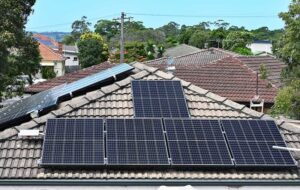
These tables were sent to RE yesterday. They give a snapshot of the output of rooftop solar PV in South Australia and Victoria, the states hardest hit by the heatwave, over five days from January 13-17.

At 1pm, the solar systems in the two states were contributing up to 600MW, and always well over 500MW, before easing down to around 350MW (and a high of more than 400MW) at 3pm.

On two of the five days in Victoria, solar PV was contributing roughly two third of its 1pm output at the time of the maximum peak – at 3.30pm. That is the equivalent of several smaller gas peaking plants, which did not have to be switched on. The same thing happed in South Australia. On other days, the maximum peak was punted to the early evening.

Screen Shot 2014-01-23 at 11.24.54 am


Comments

5 responses to “Graph of the Day: How AEMO saw rooftop solar in heatwave”

  1. Chris Drongers Avatar
    Chris Drongers

    350-600MW during daylight (working, normal peak) hours. Would someone care to take a look at the price-demand curve at this time and integrate under it’s extension by 600MW to see how much $$$$ the PV took away from traditional generators?

  2. JohnRD Avatar
    JohnRD

    Two things would have happened that affected prices.
    Firstly, very high price peaking power would have been replaced by much cheaper solar.
    Secondly, the market for very high priced peaking power would have been reduced by solar so average peak prices would have been driven down by market pressures.
    Couple of interesting questions:
    What was happening to wind power? My understanding is that the heat waves were caused by a near stationary high in the bight. I thought highs in the bight led to a wind drought.
    What would have happened if there had been peaking solar thermal power with molten salt storage in the system? Could have replaced very high priced peaking during peaks occurring late in the day.

  3. taiyoo Avatar
    taiyoo

    Congratulations on pushing this good news story.
    So the Max Output at OD was the PV being exported? In other words, self consumption is not shown on these figures? How was this information collected – is it from digital meters emailing their consumption, or was it really just estimated? If all PV systems had gross meters this information would be much easier to find!

    Chris, I downloaded the aggregated price and demand tables for Victoria for January from AEMO’s website. I have attached a picture showing the top 10 prices and the top 10 demand. Not sure if these are the figures that will answer your question, but if they are then the answer is yes – in another article someone (probably Giles) said peak wholesale price in the demand period in 2009 was something like $12,000/MWh, while this table shows the maximum price was just under $6,000/MWh. Interestingly the top 10 demand periods were all between 2.30pm and 5pm and only one was slightly above $2,000/MWh. I don’t know enough about how the market works to know if these figures actually mean what they appear to (perhaps Giles or someone more knowledgeable could comment?), if so they do tell an interesting story.

    1. Chris Drongers Avatar
      Chris Drongers

      Thanks Taiyoo. I looked at the AEMO data for Victoria. It is confused by the outage of one of the Loy Yang generators (normal business risk? so should be included in the price?). Also, the price only stands from a short interval which confuses calculations. The AEMO price seemed to rise by $100/MWhr per 400MW of demand when demand was over 7GW although there were lots of intervals in this demand range when prices were low. Is the calculation of PV substituted value something like $100/MWhr x (say) 4 hours/day x (say) 7000 MW = $2.8M averted cost per day? Please Giles, put up a more thoughtful calculation of this value, maybe APVI would have the numbers?

  4. Peter Castaldo Avatar
    Peter Castaldo

    Coal power plants like Loy Yang look like they always play a part when these high prices appear or atleast often. They are too risky. If they shut down when there’s high demand they should have to foot the bill unless they take on that risk they have the whole system at their ransom.

Get up to 3 quotes from pre-vetted solar (and battery) installers.