Graph of the Day: Australia’s solar systems become more efficient

Here’s a couple of interesting graphs that come from Energex, the network operator in the south-east corner of Queensland, which is dealing with the highest penetration of rooftop solar systems in Australia, with the possible exception of Adelaide and surrounding areas.

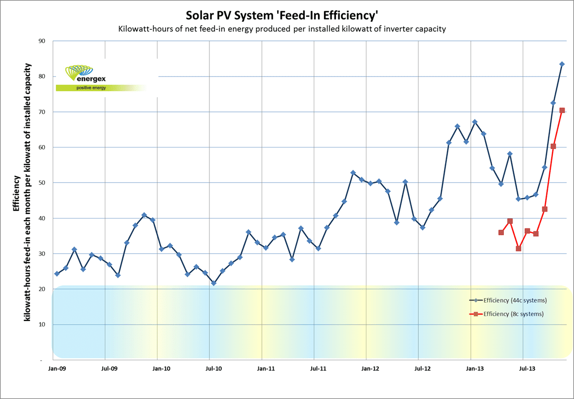
This first graph shows a remarkable jump in the efficiency of solar PV systems in south east Queensland in the last six months. The blue line represents the amount of electricity per kilowatt of installed capacity fed back into the grid from solar systems operating under the now defunct 46c/kWh feed in tariff, while the red line represents the amount under the new 8c/kWh FiT.

The fact that the blue line is higher than the red line should not surprise, because there is a greater incentive to export with the former tariff, and a great incentive to self-consume the electricity produced from the solar system under the new tariff. In fact, one wonders why the red line has increased at all.

However, there may be other reasons cited by Energex boffins.

These include the fact that solar PV systems are generally better designed and are better installed, there are more panels per inverter. Some 5Kw rated systems (with a 7Kw inverter) are pro ducting more than 40Kwh/day. The other potential factors are that households are becoming more aware of prices and energy efficiency, and possibly because this has been a relatively sunny year.

image003

This next graph is interesting because it gives the recent history of solar installations under the two schemes. Unsurprisingly, the number of systems under the 46x/kWh FiT is falling fast as the scheme winds down, and the last of those who managed to get approval finally get to install the system.

What is interesting, and promising for the solar industry, is the number of systems being built under the 8c/kWh tariff. It has enjoyed a couple of peaks of nearly 4,000 systems a month, but has been solid and not fallen below 2,000 systems a month since late last year.

image016

graph


Comments

4 responses to “Graph of the Day: Australia’s solar systems become more efficient”

  1. Stan Hlegeris Avatar
    Stan Hlegeris

    What a great graph!

    It illustrates something you didn’t mention: the multiplier effect that kicks in when you buy a solar PV system. As soon as you get your own PV and start paying attention to your production, you also start to pay far more attention to your consumption. In most cases this will boost the benefit of owning a PV system by at least 50%. That is, if you generate 10 kilowatt-hours per day you’ll probably also find ways to reduce your consumption by an extra 5 kilowatt-hours per day.

    This shows in the graph, as there’s no other reason for installed systems to get more efficient from one year to the next (apart from weather variations). The behavioural effects of owning solar systems have always been underestimated.

    This will be even clearer in the future, as the 8c Feed-In Tariff (in QLD) means you get the greatest benefit by offsetting your consumption rather than exporting.

    Soon enough these curves will turn back down as storage gets cheaper and people start to save their production for use at home. At that point only people with the old 44c Feed-In deal will have any incentive to export. The export “efficiency” illustrated here will start to decline, but for good reasons.

  2. Diego Matter Avatar
    Diego Matter

    “Efficiency” in the graph is still not where it could be.

    Per month we feed 450kWh/kWp back into the grid thanks to many energy efficiency measures and one person at home during the day.

    The actual number in the graph sits at roughly 85kWh/kWp, suggesting that that number can be doubled in the future, stopping burning coal for many other customers in the same amount fed back into the grid.

    PV owners should absolutely check their standby use with the help of a whole house power meter. Our standby usage went from 400 watts down to 14 W! One of our aircons was using 200 watts in standby alone. Now it is turned off at the breaker panel.

  3. David Osmond Avatar
    David Osmond

    I suspect most of the increase in the last 6 months is due to the length of the day increasing 🙂
    Most of the year to year increase is probably due to system sizes increasing, resulting in the amount exported (relative to the amount used in-house) increasing. This is likely due to the REC multiplier reducing from 5 to unity which no longer favors the small 1.5kW systems.

  4. Andrew Avatar
    Andrew

    When solar “efficiency” actually results in structural damage, it’s not true value: http://www.youtube.com/watch?v=s7qa6TVkoI0

Get up to 3 quotes from pre-vetted solar (and battery) installers.