We’ve given Western Australia a fair old bagging in recent months over some of its energy choices, and the recent disaster over the Muja coal-fired power station refurbishment. And we’ve given it some bouquets, such as the opening of Australia’s first utility scale solar plant, and the interest of others to build more in remote areas.
So here’s another bouquet. The state’s Independent Market Operator (the WA grid is separate from the grid in the eastern states) has recently launched a new Explore the Market page on its website, which gives some fascinating insight into where the generation in the South West Interconnected System comes from, and some detail about the state’s wind farms.
At the bottom of the page, there is also a dynamic graphic of how the generation mix has changed over the last 7 years. We suggest the change over the next 7 years will be even more dramatic.
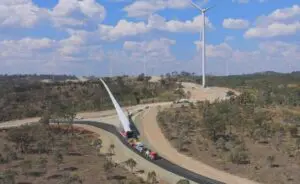
One statistic that struck us was that the Collgar wind farm accounted for around 3.2 per cent of the state’s generation. That’s about the same percentage that the 2,500MW of wind generation has on the National Electricity Market.
Please check it out.