Today’s graph of the day is a follow-up to a story nearly two weeks ago, when Ketan Joshi brought us news of how wind energy had supplied some 47 per cent of South Australia’s overall electricity requirements from August 10-18.
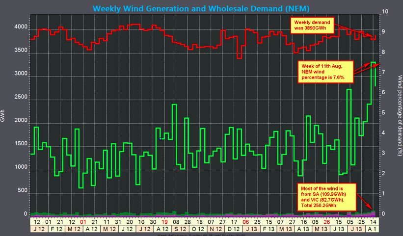
These graph below come from analyst and advisory firm IES, and many thanks to Andrew Reidy for putting them together. They tell us that South Australia’s was not the only landmark during the week. Wind energy also provided 7.6 per cent of the entire wholesale demand in the National Electricity Market. This graph below shows how much growth that represents over the previous 18 months. The bulk of Australia’s renewable energy production is normally sourced through hydro.

There were a few landmarks for individual states as well. This graph below shows Tasmania sourced nearly 14 per cent of its demand via wind energy in that week, although it had a particularly strong week in early July when nearly 16 per cent came from wind.

Victoria also set a record of its own with nearly 10 per cent coming from wind energy. Its steady rise over the last few months is due to the addition of the 420MW Macarthur wind farm, which is the biggest in the country.

And here is the graph for South Australia. It is interesting to note that the 47 per cent that was delivered in August is not the record. The first week in September last year delivered 49 per cent, and there have been numerous peaks above 35 per cent over the last 18 months. In fact, the Australian Energy Market Operator says that wind energy accounted for 27 per cent of demand for the entire 2012/13 fiscal year.

So, why so much wind energy in this one week. One reason is the increasing amount of wind generation capacity, but the biggest cause for this particular week was a series of cold fronts that hit Australia, and consistently strong westerly winds for all that week.
It could have been even more if a fourth cold front had not been deflected south of Australia. The cause is apparently due to a climate pattern called the Southern Annular Mode (SAM), also called the Antarctic Oscillation(AAO).
According to the Australian Bureau of Meteorology, the SAM is a measure of the strength and position of the westerly winds that circulate around Antarctica.When SAM is in a positive phase the polar westerly winds speed up causing low pressure systems and cold fronts to contract towards the South Pole.
A negative phase SAM involves low pressure systems circulating closer to southern Australia. This results in more cold fronts sweeping up into southern Victoria in winter increasing the chance of rainfall, and the winds. Hence the graph below, where the SAM was strongly negative around August 16.