The steady rise of Earth’s temperature as greenhouse gases accumulate in the atmosphere and trap more and more heat is sending the planet spiraling closer to the point where warming’s catastrophic consequences may be all but assured.
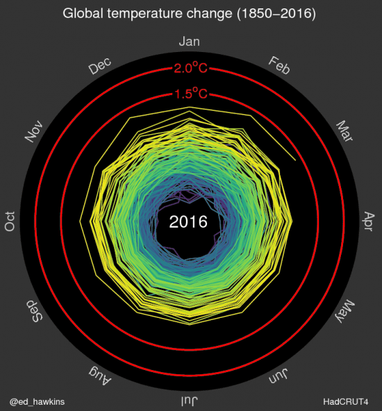
That metaphoric spiral has become a literal one in a new graphic drawn up by Ed Hawkins, a climate scientist at the University of Reading in the United Kingdom. The animated graphic features a rainbow-colored record of global temperatures spinning outward from the late 19th century to the present as the Earth heats up.
To see the animated version, you need to click on the link below the image.

“The pace of change is immediately obvious, especially over the past few decades,” Hawkins, who has previously worked with Climate Central’s extreme weather attribution team, wrote in an email.
The graphic is part of Hawkins’s effort to explore new ways to present global temperature data in a way that clearly telegraphs the warming trend. Another climate scientist, Jan Fuglestvedt of the Center for International Climate and Environmental Research – Oslo, suggested the spiral presentation.
The graphic displays monthly global temperature data from the U.K. Met Office and charts how each month compares to the average for the same period from 1850-1900, the same baselines used in the most recent report from theIntergovernmental Panel on Climate Change.
At first, the years vacillate inward and outward, showing that a clear warming signal had yet to emerge from the natural fluctuations that happen from year to year. But clear warming trends are present in the early and late 20th century.
In the later, it is clear how much closer temperatures have come to the target the international community has set tokeep warming within 2°C (4°F) above pre-industrial levels by the end of the 21st century. An even more ambitious target of 1.5°C (3°F) has increasingly become a topic of discussion, and is also visible on the graphic.
Michael Mann, a climate scientist at Penn State who created the famous “Hockey Stick” graph of global temperature records going back hundreds of years, said that the spiral graphic was “an interesting and worthwhile approach to representing the data graphically.”
He said that using an earlier baseline period would have better captured all the warming that has occurred, as there was some small amount already in the late 19th century.
Just how much temperatures have risen is clear in the first few months of data from 2016, it’s line clearly separated from 2015 — which was the hottest year on record — and edging in on the 1.5°C mark.
Every month of 2016 so far has been the warmest such month on record; in fact, the past 11 months have all set records, the longest such streak in the temperature data kept by the National Oceanic and Atmospheric Administration. (Each agency that keeps such a temperature record handles the data slightly differently, which can lead to small differences in monthly and yearly values, though the overall trend is in broad agreement for all such agencies.)
The record-setting temperatures of 2016 have seen a small push from an exceptionally strong El Niño, but they are largely the result of the heat that has built up in the atmosphere over decades of unabated greenhouse gas emissions — as the spiral graphic makes clear.
“Turns out that this version [of temperature records] particularly appeals, maybe because it doesn’t require much interpretation,” Hawkins said.
This article was originally published on Climate Central. Re-produced with permission.