One of the most popular features of the RenewEconomy website is the live generation widget, found on all pages or in more detail here, that shows how much of the country’s generation comes from coal, gas, hydro, wind, solar and rooftop installations at a particular point in time.
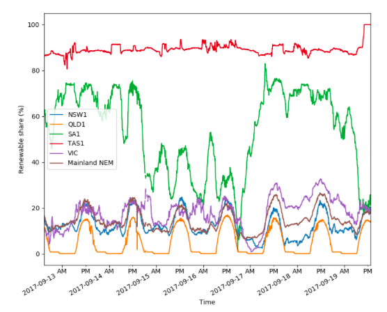
Now, two new “live” graphs have been launched and self-funded by Ben Elliston, a consultant with ITP Renewables, that shows the share of renewable energy in each state over the last seven days, along with the rolling seven-day estimate of emissions from each state.

Here (above) is the renewable energy share graph, updated in the early afternoon of Tuesday, that shows – naturally enough – Tasmania leading the way courtesy of its hydro resources, and South Australia following, based mostly on wind but also its growing rooftop solar contribution.
(See our story here about rooftop solar contributing 48 per cent of the state’s electricity needs at one point on Sunday, when it pushed demand for grid power down to a record low.
The state with the lowest contribution from renewable energy is Queensland (orange), but what is interesting about the graph is how it jumps each day to reflect its huge resources of rooftop solar – now estimated at more than 1.8GW.
It also has about 2,000MW of large scale solar farms under construction of contracted and has yet to build any major wind farms, although two are being contracted now (Cooper’s Gap and Kennedy).

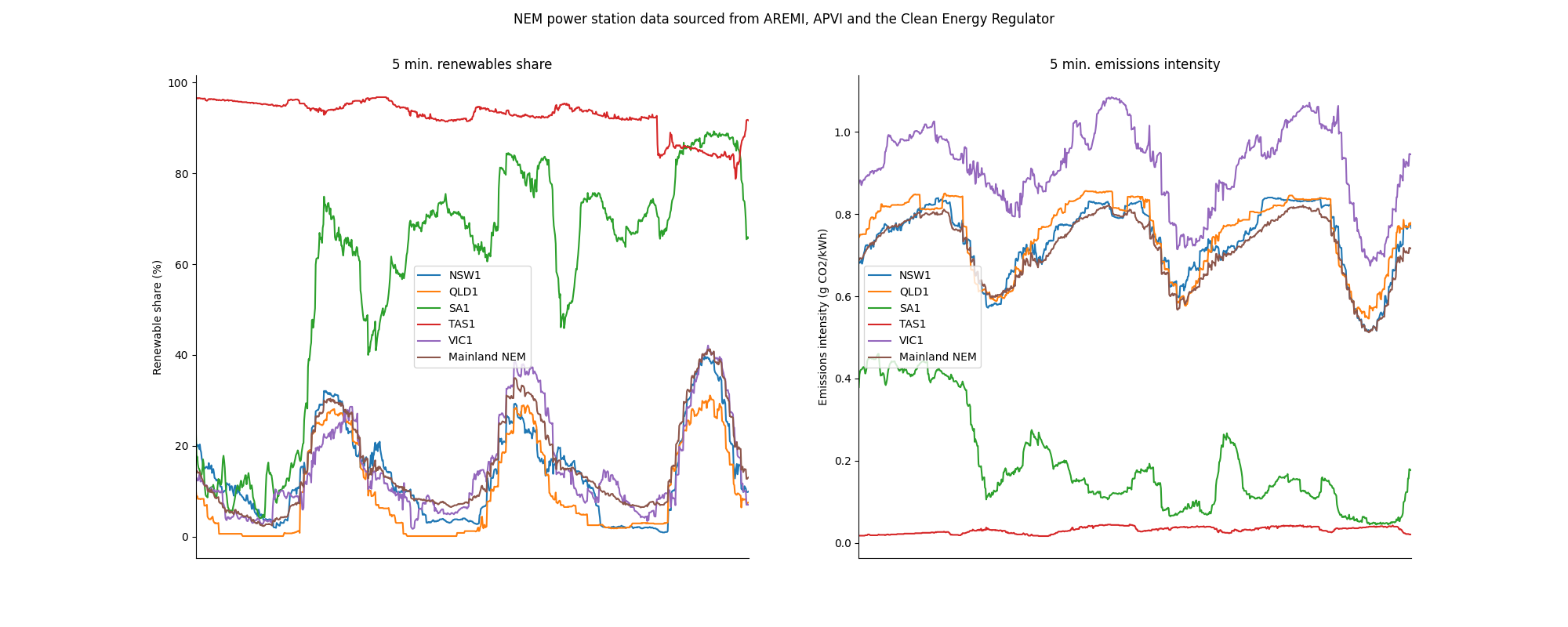
The graph on emissions (above) is also interesting. Tasmania has the lowest of course, followed by Suth Australia, which oscillates depending on the output of wind and solar, but always remains well below the national average (brownish line).
Victoria (lots of brown coal) has the worst level of emissions, followed by Queensland (lots of black coal), although that dips every day when the rooftop solar comes into play.
Interestingly, NSW (blue line) more of less follows the national average, although it has more at night time because of its high dependence on black coal.
Elliston says it is clear from the graphs that solar is reducing NEM-wide emissions from about 750g/kWh at night to about 650g/kWh in the middle of the day.
“You can see how Queensland emissions look like an inverted daily solar curve, reaching the lowest point at noon each day. Likewise for Victoria and NSW to a less clear extent.”
The data from the graph is sourced from APVI data and AREMI data. They can be found here.


