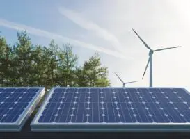
 A key issue in the climate debate relates to the role of natural gas as a potential climate bridge.
Judging by the hype surrounding the US shale-gas revolution, you might guess that natural gas was a sure-fire solution. Certainly, enfant terrible of the environmental movement, Bjorn Lomborg, thinks so.
In a recent piece in the Australian, Lomborg argued the case that ‘Gas is greenest in the short term’, citing the experience of the US shale-gas revolution. To do so, Lomborg uses a logic for which I may have been at least partly to blame. But for the reasons outlined below, I don’t think the data support the case.
First, the background …
In the northern summer of 2013, I shared the stage with Lomborg at a joint session at the International Student Energy Summit titled “A Crossroad to a Sustainable Future, Will We Ever Overcome Our Carbon Addiction?” in Trondheim, Norway.
No doubt everyone in the packed auditorium was there to see Lomborg. He didn’t disappoint, relishing the opportunity to provoke and cajole the young and somewhat hostile audience in his own inimitable way.
I was very much the filler, and though I doubt anyone in the audience knew of me, I enjoyed the occasion immensely. My talk covered a theme I subsequently posted on the Conversation, in a piece titled the Black Decade. I focussed on a figure, like the one below, showing how tightly global energy emissions scale with economic activity. I made the point, as many others have before, that the phenomenal scale of our use of fossil fuels provides an ‘emissions lock’ – economic growth has come inevitably at the cost of emissions growth.

In recent history, significant reduction in the rate of emissions growth has only been achieved through severe global recession, most notably in the years of 1982 and 2009. In his recent piece, Lomborg picked up on this logic, adding that on longer timescales wars have provided another effective way to reduce the rate of emissions growth.
In his piece in the Australian, Lomborg makes a point that I wholeheartedly agree with. Neither recession nor war are particularly palatable mechanisms for dealing with the climate challenge.
In my 2013 talk in Norway, I stressed that the challenge is to move off the emissions lock, to a part of that diagram we have never been in before. To achieve 80 percent reduction in greenhouse gas emissions by 2050 we need reduce emissions at an average rate of about 4 percent, each year. In other words, we need on average to be on the green line at the very bottom of the figure. To do so without economic calamity requires a dramatic de-carbonisation of the economy, so that we stick to the right hand side of the diagram characterised by economic growth. The challenge is to move off the ‘emissions lock’ towards the bottom right (or, at worst, the bottom centre), rather than slide down the lock to the bottom left.
As highlighted in my piece the Black Decade, the problem is that rather than moving towards that goal, the world is moving away from it. Over the last five years the emissions intensity of the global economy has increased above trend.

This point is best illustrated with a variant on the plots above showing the residuals obtained by removing the economic trend. The residual plot clearly shows the above trend increase in global emission intensity over the last five years, by about 0.7 percent. In real terms that amounts to an extra 1.2 billion tonnes of CO2 added to the atmosphere over the five years, over and above the additional 2.5 billion tonnes expected for the ‘business-as-usual’ annual GDP growth of about 3 percent for the period.

So much for ‘decarbing’.
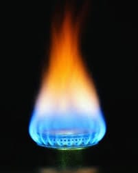
What has it all got to do with the US shale-gas revolution?
In his recent piece, Lomborg suggests that gas is the best short-term hope of breaking the emission lock. To quote, ‘Look[ing] at the dramatic reduction in US emissions since 2008 … shows that there is one other solution to CO2 apart from wars and recessions: fracking, a new technology to get gas out of the ground cheaper and more plentifully.’
The key is the explicit assertion that Lomborg makes, that there has a ‘dramatic reduction in US emissions since 2008’. The implicit assertion is that, if there has, it is more than we would expect from economic factors alone.
In the spirit of the Skeptical Environmentalist these assertions are worth testing. To do so, we need to factor out the dominant economic signal, which is not inconsiderable. That is well illustrated by 2009 – the deepest recession in the US in over 30 years. In 2009, US emissions declined by about 6.6 percent on the back of a 2.6 percent reduction in GDP. As the figures below show, that reduction in emissions over the last five years is only marginally greater than would be expected from the economic slowdown alone.
So the short answer is that the US shale-gas revolution hasn’t substantially impacted the emissions intensity of the US economy, over and above that expected from the slowing economy.
In fact the impact has been effectively “squat all”, according to BP’s data [1]. While both 2011 and 2012 show significantly negative residuals reflecting significant reductions in emission intensity, that was countered by the significant positive residual anomalies in years 2010 an 2013. The net result is that the average US emissions residual over the five year period is only -0.2 percent. While there has been a reduction in rate of growth in emissions over the period (-1.2 percent absolute), it can be accounted for almost entirely by the low average US economic activity (average GDP growth of 1.2 percent).


Going by US Energy Information Agency – or EIA – and World Bank projections, the next few years are not looking much better. The EIA predicts US energy sector emissions will rise again by 1.4 percent this year (2014), before falling marginally in 2015 [2]. On the basis of World Bank assessments of GDP growth, the six-year average for the period 2009 though 2015 is set to be at or above trend (i.e., a slightly positive residual), in spite the much vaunted shale-gas revolution.
In reality, the emission reductions achieved by the US have resulted from sliding down the emission lock, rather than moving off it.
So much for the for the role of gas as a climate bridge.
While it might seem unrelentingly gloomy in terms of the climate implications, the concern in my talk at Norway was not entirely pessimistic. I was at pains to show that one country in particular had seemingly broken free of its emission lock, and it had nothing to do with gas.
The country in question was Australia.
One year further on, with an updated dataset courtesy of the latest release of BP’s Statistical Review of World Energy, the evidence is now even more clear.


For four out of the last five years Australia’s energy sector emissions growth has been negative. In contrast with the US, the residual emission anomaly for the 5-year period is signficantly below trend at -3.4 percent (absolute -2.4 percent), despite the factor of two higher GDP growth (average 2.5 percent)
Sadly Australia’s emission intensity is set to start rising again, potentially at alarming rates, as key emission reductions policies are unwound by the current government.
That places the US, Australia and the whole world literally between a rock and a hard place. And every good geologist knows that gas is very much the stuff of soft rocks.
Notes:
[1] the data used in this analysis reports emissions in the energy sector covering all fossil fuels (transport, stationary energy, etc …) based on consumption data as reported in BP’s Statistical Review of World Energy (release date June, 2014). The GDP data are from the IMF’s World Economic Outlook (release date April 2014).
[2] The US EIA estimates “that carbon dioxide emissions from fossil fuels increased by 2.4% in 2013 from the previous year. Emissions are forecast to rise by 1.4% in 2014, and then to decline by 0.6% in 2015. The increase in total emissions in 2013 and 2014 reflects increases in emissions from coal of 4.2% and 2.7%, respectively. The price of natural gas to electric power generators rose on average by $0.91/MMBtu in 2013 and is projected to rise by $0.95/MMBtu in 2014, contributing to an increase coal use. Coal emissions are projected to decline by 2.6% in 2015 .” see (release date August 12, 2014). The World Bank’s Global Economic Prospects (GEP) predicts US GDP growth of 2.1% and 3.0% for years 2014 and 2015,respectively
(release date June 2014). Note that the EIA “projects total coal consumption growth of 2.5% to 949 MMst in 2014 because of higher electricity demand and power sector natural gas prices 22% above their 2013 level. Total coal consumption is projected to fall by 2.7% in 2015, as retirements of coal power plants rise in response to the implementation of the Mercury and Air Toxics Standards, electricity sales growth slows to 0.4%, and natural gas prices fall relative to coal prices.” (Release Date: August 12, 2014).
Source: The Conversation. Reproduced with permission.