Why South Australian wind farms generate more, but earn less

Watt Clarity

Following on from comments received (online and offline) with respect to my article a couple weeks ago with respect to see-saw wind generation in South Australia (and hence prices as a result) I have been pondering a couple of things – but unfortunately no time to dig deeper.

With a short amount of time late last week, I powered up NEM-Review to begin the task of delving further, but have had to curtail that contemplation to come back to the here-and-now.  Rather than leave the analysis I’d done gather dust, I’ve presented two charts here for a sample of 21 wind farms in the NEM highlighting two key metrics that, I believe, sum up the two sides of the puzzle:

1)  Capacity factors

The sense I have picked up by reading commentary (and hearing comments) by people interested in wind energy in recent years is that there are people who sit at either end of two extremes:
1a)  At the bottom end, there are those who operate with a rule of thumb that wind farm capacity factors will be 30% (with a layperson possibly inferring, from such comments, that this forms an upper bound to the capability of wind farms); whilst
1b)  At the other end, there are those who speak about wind farm capacity factors of 45% and above (with the same layperson, if listening to this other conversation, possibly inferring that most wind farms will be achieving this 45%-and-above, whilst the 30% mark is an out-dated one of yesteryear).

With reference to 21 of the wind farms currently operational in the NEM, here’s how they have actually performed:


rsz_12015-08-31-wind-capacity-factors_thumb

We can see from the above that, with the plant selected, the capacity factor did reach as high as 45% (one wind farm in one year shown – Snowtown in SA in 2013-14), but that there are also a number of wind farms bumping around at, or below, the old 30% mark.

There is a fair spread of capacity factors from a low of 25% to a high of 45%.

There’s a few series on the chart, so I have tried to make it more useful by colouring wind farms in SA some shade of red, wind farms in VIC green, wind farms in NSW blue and the only TAS wind farm shown black (my apologies if I made a mistake in some of these).

What we can see, in the above, is that the wind farms in South Australia are the ones which are achieving the higher capacity factors – which provides some answer* to the question I asked back in this post here

These higher capacity factors are especially relevant when considering that a significant proportion of the revenue earned by wind farms is a “simple” $/MWh measure (through the LRET target) that does not take account of the effect that increased production of energy from wind has on the broader energy market.

Wind Farm Revenue = LRET Market Revenue + Energy Market Revenue

The remaining amount of the the revenue earned by wind farms (Energy Market Revenue) is, however, affected by these locational factors – as discussed below.

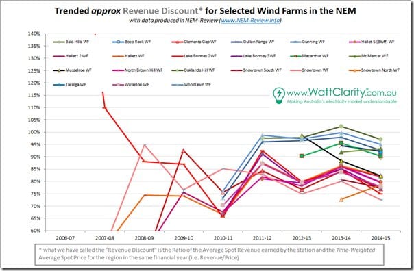
2)  Spot revenue “penalty”

The other side of the coin is shown in the second chart, below – where I have calculated the average spot revenue earned by each of the wind farms.  I’ve then taken that number and expressed this as a ratio to the time-weighted average spot price for the region in which the wind farms are located.

For ease of understanding, the same colours have been used:

rsz_2015-08-31-wind-spot-revenues_thumb

Ratios less than 100% show that the wind farm is earning (per MWh) less than the average spot price for the region.  In contrast, the volume-weighted average price for the year (i.e. paid by the “average” energy user) is typically above the time-weighted average spot price – because spot prices typically are higher when demand is higher.

As can be seen in the above, wind farms in South Australia are (by this measure) “under-earning” their counterparts in the larger regions because of the larger depressing effect wind has on spot prices the South Australian region because:
(a)  Wind farm output shows high degree of correlation across South Australia (as all readers can observe by watching the NEM-Watch Live-Gen widget on RenewEconomy or in more detail in NEM-Watch itself); and
(b)  Especially because aggregate wind farm output (when windy) represents a significant percentage of the demand in the region.

In other words, performance to date of the LRET has seen a high proportion of wind attracted to SA because of higher capacity factors on offer – despite the fact that the large volumes of energy dumped into the energy market as a result are eroding the return all SA wind farms* are earningfor their NEM component.

*  note – “return all SA wind farms…” might be more correctly labelled the returns earned by the counterparties exposed to spot prices for the revenue earned.  That’s probably a key distinction.

3)  Questions for the future

It seems likely to me that the future will see even more of this dichotomy emerge in the South Australian region (i.e. lower prices when the wind is blowing and sun in shining, versus higher prices as thermal plant seek to recover fixed costs over less MWh when it’s cloudy and still).

Hence the “Revenue Discount” shown above for SA wind farms will continue to grow – which might lead to its own form of self-perpetuating spiral.

Now that there is (perhaps) some “certainty” about the 2020 target for the LRET, and stakeholders think more about what the trajectory might be out into the future, perhaps considerations might be given to whether simply continuing a split revenue-stream model and increasing the target is the most appropriate mechanism.

I will continue to ponder this aspect of the evolving energy market and (as time permits) continue to analyse and post insights earned on WattClarity®.

Comments

14 responses to “Why South Australian wind farms generate more, but earn less”

  1. David K Clarke Avatar
    David K Clarke

    The graphs look like they would be very interesting. Unfortunately they are too small. I can barely make out the text.

    1. Paul McArdle 3 Avatar

      Sorry that bit did not copy across, David

      Please refer to the original article here, and click on the charts to open larger size:

      http://www.wattclarity.com.au/2015/08/a-further-look-at-the-idiosyncrasies-of-wind-in-south-australia/

      Does this help?

      Paul

      1. David K Clarke Avatar
        David K Clarke

        Yes, considerably better thanks Paul. Although I still have trouble finding the lines for some wind farms; eg. Snowtown South. It’s a lot of lines on one graph. Difficult.

  2. Mark Roest Avatar
    Mark Roest

    What is the price of storage in SA now? What happens if it is <$200 per kWh capacity, and <3 cents levelized cost of energy delivered out of storage? The data doesn't tell us what the price of the dumped electricity would have been, nor the "higher prices as thermal plant seek to recover fixed costs over less MWh when it’s cloudy and still." Can you get a handle on it, or present all the data so we can crowd-source an understanding of where things are headed in the future? Could you also try to get the cost per kWh of the turbines, assuming they were not forced to dump and could use their whole life cycle for production?
    Another way of saving the wind farm economics is to reduce the cost of towers, blades, and assembly on site. There is definitely a way to do that.

    1. Mike Dill Avatar
      Mike Dill

      Looking at the graph and guessing that the average wind farm got 75% of spot over the year, with about 4000MW running at 34% of capacity. That would imply about 35TWH available from wind. I do not remember what the average spot price for the year was, so i will put in a guess at $100MWH, making the ‘loss’ for having to much renewable capacity somewhere near $800 million, assuming that all of the energy was paid at spot and not through a PPA.
      Note:

      Most wind currently has a PPA of some type.
      When the wind blows, it pushes the spot down due to more supply, as does solar.

      Putting the ‘extra’ wind into storage will not currently do much, as even three cent storage will bring the spot up when the wind is not blowing, negating a significant part of the wind advantage.

      1. Mark Roest Avatar
        Mark Roest

        Hello Mike,
        I’m not familiar enough with the spot markets to quite understand what you wrote. Could you please break out the last paragraph a bit more? I understand the sentence before it, pushing spot [price] down by having lots of supply.
        The way I visualize it, the wind farm would put out as much as the utility or regional aggregator can take, and put the rest into storage, when there is a surplus of wind. When the market can absorb more than the wind and / or solar systems can produce, and preferably during peak load on the system when it is willing to pay the most, electricity in battery storage (molten salt energy for solar power towers) would be added to the renewable system’s output, up to the amount the market will pay for.
        OK, now I see that adding storage will drop the price offered a little bit, when there is already enough on offer to meet the demand.
        So then, what about when there is a larger shortfall of wind and solar supply, vs demand? The larger the shortfall, the higher the price. Does it go up in a steady curve, or stepwise? A good energy management system that monitors the spot market over time, as well as the weather conditions, can ‘choose’ to sell when the price is highest, and also, if the utility offer price is a step function, then the system could take advantage of (arbitrage) the steps.
        Hypothetical example (here I am guessing about the way the market works, so I’m open for correction / restatement):
        The utility’s usual cost to procure / offer-to-buy price is $0.05 per kWh at night, $0.10 during most of the day, and $0.20 peak.
        The wind farm’s objective is to sell as much as possible for as high a price as possible, and there is virtually no marginal cost of goods sold except perhaps 2% to 4% O&M for a newer project, and possibly a reserve for eventual major replacements.
        For storage, there is some point at which the cost of additional storage outweighs the earnings it can provide, in a given wind farm. At current prices that may be less than 1 hour of storage. NREL determined that the sweet spot for molten salt storage with solar thermal is six hours. I’ll make a wild guess that the mss can deliver for $0.02 per kWh. So I’ll also guess by extrapolation that a battery with a levelized cost of $0.03 per kWh would have a sweet spot of 4 hours, and that a battery with a levelized cost of $0.01 would have a sweet spot of 12 hours.
        How would the spot price market respond at peak, say from 6 p.m. to 10 p.m., if the wind farm has six hours of storage which it can deliver in 2 hours if necessary, or in 4 hours; there is enough wind during those hours to deliver 4 full hours of production; the fossil fuel peaker plant is able to deliver 1.5 wind-farm-equivalent-hours per hour (or 6 wind-farm-equivalent-hours in 4 hours); the utility’s situation is that while running both its $0.05 and $0.10 marginal cost generators, it is 10 hours short this sweltering evening.
        Let us assume that the peaker plant has a break-even point of $0.15 per kWh, and is willing to run at this price if necessary.
        If the spot market is able to account for the total amount of available supply from each participant (it may not be), then I envision the peaker plant offering its full 6 hours equivalent at $0.15 per kWh, and the wind farm countering with an offer of 4 hours at $0.20 per kWh, while the storage offers 6 hours at $0.14.
        Analysis: the wind farm covers the amount that the peaker plant cannot, at full price. The storage sacrifices $0.06 per kWh, both deferring to the wind farm it serves, and to squeeze all of the peaker’s production out of the market, yet still sells at a $0.12 per kWh gross margin if you include amortization, in order to justify providing the storage at all, since it’s not demanded by the terms stated so far.
        It seems to me that this strategy could also work if the levelized cost of the battery were $0.10 per kWh — it would have a $0.04 gross margin at $0.14 per kWh, and still have the added advantage of helping squeeze out the fossil fuel equipment, and dissuade financiers from funding another fossil fuel plant for the additional 4 hours of peaking capacity that the existing peaker could not fill. Since the financiers would want to put their money to work, the obvious best place for it would be 4 more hours of combined wind farm and battery storage capacity, at a likely price, by the time it’s needed in 3 years, of well under $0.09 per kWh. It will be able to squeeze out the peaker plant entirely, and pave the way for additional wind farms and battery storage to get rid of the $0.10 marginal cost generators.
        In figuring it out this way, I am visualizing the spot market as a simple, yet smart and aware, arithmetic buffer between the utility and the electricity generators, even if they are owned by the utility. The storage battery set is, likewise, a simple, yet smart and aware, arithmetic buffer between the wind farm, and both the utility and the spot market.
        Is there something I’m missing? For example, is the spot market unaware of the total available supply, including capacity which might be being withheld from the market?

        1. Mark Roest Avatar
          Mark Roest

          Here’s something from the Redflow article:
          https://reneweconomy.wpengine.com/2015/redflows-hackett-battery-storage-as-common-as-broadband-within-10-years-46293

          “At the moment – over a 10 year period – Redflow estimates the cost of
          production at around US 20c/kWh. Even with the exchange rate taken into
          account, and given that solar electricity probably costs between
          10-13c/Wh, that is putting the technology in the ball-park, where it
          starts to compete with the grid.

          “If we get another halving of that number over time, then everything
          gets rather fascinating,” Hackett says. That, he notes, is where the
          price drops between the differential between peak and off peak pricing,
          and battery storage becomes no brainer in a country with high
          electricity costs, mostly driven by the high cost of the grid.

          “In anticipation of this, and in response to more rises in electricity prices, Hackett says the market is “going mad”.

          “The interest level is enormous. It feels like exactly what I was
          doing in internet terms 15 years ago. It is early days and everything
          costs more than people would like it to, but volume increases will
          surely drive prices down.”

          1. Mike Dill Avatar
            Mike Dill

            YES! Batteries ‘buy’ the dips in the spot prices, and ‘sell’ at the peak rates. But like wind and solar, the more you put in the flatter the eventual curve becomes.
            I think Hackett is right, and that the battery prices will continue to come down. My guess is about 10% per year. By the way, Tesla energy says that they are sold out through 2017, at about 15 to 20 cents per KWH base on current guesses.

            As storage and solar increase, the ‘peak’ spot for a particular day will drift to the lower of the cost of wind (if the wind is blowing), or the cost of storage.

          2. Mark Roest Avatar
            Mark Roest

            Can there be a split of the peak pricing, based on how much of a particular resource is available on a given day? Like, the market sops up the lower price, then switches to the next higher price, until it is satiated?

          3. Mike Dill Avatar
            Mike Dill

            In most places the spot price is the last bid that provides the desired amount of power.

            Since Solar and Wind have very low operating costs, they are usually low bidders and are used first. If that is not enough the next lowest bidder provides more, until the total load requirement is met. The price of the last contract is the spot price for that period of time.
            in some places other energy sources can continue providing power at the spot price, which might be less than their cost to generate the power, but less than the cost of turning the plant off and on again.

            Those plants that need to continue running (think nuclear) are often referred to as baseload, while the plants with flexible supply characteristics (hydro for one) are ‘dispatchable’.

            Wind is often criticized as ‘non-dispatchable’ and ‘variable’ or not ‘firm’. Adding storage (extremely dispatchable) to wind ‘firms’ up the power, so that it can be used as ‘baseload’ or as a dispatchable asset that can supply power as demanded from the grid.
            Solar is also variable, but the sun usually shines every day, so it is more ‘dependable’, but still not dispatchable.

  3. Ronald Brakels Avatar
    Ronald Brakels

    The reason why some South Australian wind farms have high capacity factors is generally not because of location. Wind resources aren’t really better than in Victoria or Tasmania or Western Australia. The reason why South Australia’s new wind farms have high capacity factors is because the state has a lot of wind farms.

    Generally speaking, the first wind farms built in an area are built to maximise total output and so have large generators compared to rotor area. But once there are enough wind turbines to start driving down electricity prices when its windy, new windfarms get optimised to have higher capacity factors and have smaller generators in comparison to rotor area that make better use of weak winds and shut down when winds are strong, since electricity isn’t worth very much during these periods anyway. Hence Snowtown II, the newest wind farm, having such a high capacity factor.

    I think the reason why wind farms keep getting built in South Australia is because of stupidity by other other state governments such as Victoria’s wind power restrictions, which resulted in a cluster of wind farms being built just inside South Australia; a nice little boost for the South Austalian economy there, thanks Victoria. A supportive state government by Australian standards. An established wind industry and experience helps, both with costs and reducing opposition from people who think wind turbine will cause their goats to rotate counter-clockwise. And I’m sure being not very populated and having cheaper land would result in lower payments to landowers. And then there’s the biggie. Wind in South Australia tends to displace expensive natural gas use instead of cheaper black coal, or brown coal which only costs Victoria a few dollars a tonne to rip out of the ground and toss on a conveyor belt. Wind is also displacing coal in South Australia, but SA coal power is not nearly as cheap is in Mordor, sorry, I mean Victoria.

    1. Paul McArdle 3 Avatar

      Thanks Ronald
      Not sure I follow the first bit of your logic – it’s actually Snowtown (i.e. the old station) that hit 45% capacity factor in 2013-14.

      Snowtown North and South (the newer bits) were only starting up in that year so only have data for the full 2014-15 FY where they underperformed compared to their older sibling:
      Snowtown (old) = 39% in 2014-15
      Snowtown South = 37%
      Snowtown North = 33% (though have not checked when commissioning had finished on that one).

      Paul

      1. Ronald Brakels Avatar
        Ronald Brakels

        I wasn’t paying much attention, was I? But the general point that newer farms tend to be built for higher capacity factors should hold true.

        If it doesn’t, that means I’m wrong.

    2. neroden Avatar
      neroden

      Ronald, I *have* to borrow that phrase: “opposition from people who think wind turbines will cause their goats to rotate counter-clockwise”

      Cracked me up.

Get up to 3 quotes from pre-vetted solar (and battery) installers.