Every year a disparate collection of 88 wonks from 68 organisation in 12 countries work tirelessly to produce the Global Carbon Budget.
I think of it as a high powered pictured book alternative for anyone who can’t stomach the IPCC’s summary for policy makers (or just wants the data).
Here are 11 of the most thought provoking charts from this years report:
1) Carbon emissions are still going up

Another 2.3% in 2013 with projections that it will rise a further 2.5% in 2014.
2) Coal is the major source of growth

Coal was responsible for 59% of emissions growth in 2013, oil was 18%, gas 10%, and cement 12%.
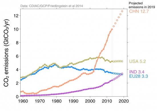
3) China’s emissions just keep going (and going)

Most emissions growth occurred in China. In per capita terms its terrestrial emissions now exceed Europe
4) But in historical terms the US and EU still dominate

Over the 1870-2013 periods cumalative emissions from the major emitters were the USA (26%), EU28 (23%), China (11%), and India (3%).
5) And China emits a lot making goods for the EU and US

The EU and US have outsourced significant industrial emissions overseas, particularly to China.
6) At this rate the 2C carbon budget will be blown in decades

If emissions continue to grow we will blow through the total 2°C carbon budget in before 2040.
7) If we keep this up its going to get really hot

Our current emissions growth is on the pathway that expects the world to warm by 3.2°C to 5.4°C by the end of the century.
8) We need to keep most fossil fuels in ground

To have a chance at 2C around 2/3 of current reserves need to stay in the earth.
9) Mitigation needs to occur at unprecedented rates

The best historical mitigation rates are about 4% during European nuclear switches. So these look unlikely to say the least.
10) Declining deforestation is the only success story

Land use emission have declined since 1990s (the spike is the Indonesian peat fires).
11) And the ocean and terrestrial sinks

The ocean and land sinks continue to soak up an incredible amount of carbon as fertilization trumps saturation. Without them atmospheric CO2 would already be up around 540ppm (its currently 397).
Without them it would probably be 2C warmer already.
Source: Shrink That Footprint. Reproduced with permission.